
Spend some time on any social media channel and chances are you’ll come across an infographic or two. Content creators have embraced the infographic as a way to share information in a designed, highly-visual package. Who doesn’t love a visual story broken down into bite-sized snippets with interesting data points all presented in a nice, pretty package? We all do. But be warned, not all infographics are created equal. Just like most things in marketing, when something proves popular, favorable, and effective, it isn’t long before every marketing firm jumps on the bandwagon. There’s nothing wrong with embracing a new vehicle for reaching audiences, but poorly written and poorly designed infographics miss the mark.
DOWNLOAD THE COLOR THEORY INFOGRAPHIC
Audiences be Warned
When we say not all infographics are created equal we mean everything from design to data. When reading through infographics, be wary of the data points. Check the sources and make sure the data is coming from a reputable source before accepting it as truth. We see a lot of infographics made by essentially ripping down the data points from another infographic, changing around some images and posting nearly the same thing. These often fall victim to the telephone effect, where some things are lost in translation or completed misquoted.
A Lot of the Same
Because everyone wants to put out infographics, you’ll see a lot of the same with very little variation. Everyone wants to do an infographic on time management or the cost of a new employee. So what’s the point of creating an infographic that’s been done a hundred times before? There really isn’t one. When thinking about putting together an infographic, think of new ways to present the information or a new angle for communicating the point. People are much more attracted to authentic and creative content.
Bring A Fresh Perspective
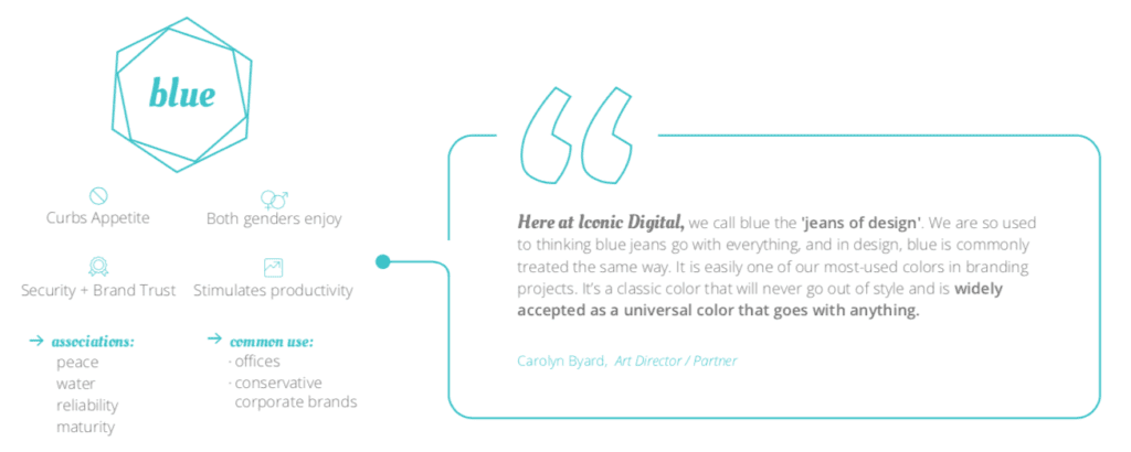
Yes, one of our designers made an awesome infographic on color theory. Why? Because there are many, many infographics on color theory, but very few are in-depth, reputable and detailed to the level a true infographic should be. Good infographics take time. From conception to research to design to final edits, the process is long, and it should be. Our color theory infographic goes deep into what associations the brain typically makes with primary colors, cultural significance, and how we at Iconic utilize color theory for our clients. Research and many iterations went into creating our color theory infographic because there’s no reason to create another infographic if it doesn’t tell the audience something new.
What Makes a Bad Infographic
Lazy research is one of the biggest issues we see in infographics. Yes, the design is extremely important, it draws people in, but it’s the data that keeps a reader interested. Citations and consistent source formatting helps guide your readers through the information while giving them reassurance that the information is credible. A lot of people pull information down from other infographics without checking the validity of the information.
Poor Design
There are many, many websites that help you build infographics. While these seems really helpful, they add to the overwhelming number of infographics that look the same. With templates, in many cases, the colors and fonts are already chosen and the imagery comes from a stock library. Now not all of these designs are bad, but without a professional designer on staff, it’s easy for an infographic to get out of control. Too much content cluttered together makes them difficult to read. Sparse content without a clear flow leaves readers confused. When designing our color theory infographic, our design team thought carefully about the flow of information and how a reader would comprehend the information.
Infographics are a great tool for sharing content. When done well. If you’re thinking about stepping into creating infographics, take some time and think about the flow of information and how you’ll go about collecting data points. Try to think of a unique angle and surprise your readers with something they don’t already know. If your infographic is going to live somewhere on your website, make sure it stays current and relevant. This could mean updating it from time to time or rewriting content to keep up with new statistics or information. If you’re color theory nerds like us, check out our color theory infographic and learn something new or use our branding infographic to see how your brand stacks up.