Why is it important to develop strong typography ideas?
![]() Today, we present typography ideas from Disney. We had so much fun writing our post about superhero logo design that we thought we would continue to embrace our inner child.
Today, we present typography ideas from Disney. We had so much fun writing our post about superhero logo design that we thought we would continue to embrace our inner child.
Let’s start with the basics. Good typography can make or break everything from logos to websites to print materials. Your typography shouldn’t just look pretty… it should subtly provide a visual indicator of context. Still confused? Let’s apply some Disney magic to the situation.
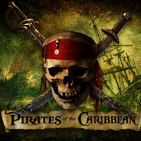 Pirates of the Caribbean
The typography in the Pirates of the Caribbean logo is an obvious win. Reminiscent of the font Black Moor, this typography has its own twist that says, “Hey, this movie is about a bunch of pirates.” Good typography needs no imagery… just a look that will convey meaning to people who see it.
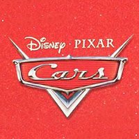 Cars
Cars
The Cars typography is a revival of Magneto, which is a font that was modeled after type used on cars in the 50s. You’ll see that they have taken something that already intrinsically says “car”, and added chrome effects and a metallic emblem. There you have it. Ideal typography for a movie about talking cars. The only possible critique could be that it could seem above the heads of the target market on its own. Disney solved this by using i
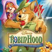 Robin Hood
Disney’s Robin Hood employs the classic, strong calligraphy that we have learned to associate with the Middle Ages. On top of that, they used the green, a color long-associated with the good-hearted outlaw, Robin Hood. Disney achieved simple and readable but played with the serifs just enough that this typography feels medieval. The downside is that something about this typography seems stretched, which can feel uncomfortable for some designers. Still, the typography gets the message across.
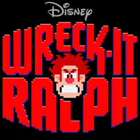 Wreck-It Ralph
Wreck-It Ralph is a recent Disney film about a video game villain who is past his prime. This typography hits the retro video game mark. It is not beautiful by any means… in fact, it seems rather clumsy compared to some of Disney’s more elegant work. The fact of the matter is that sometimes, to convey a message, you have to make some sacrifices in your typography. If you look at typography in old video games, the limited number of pixels makes the fonts seem clumsy and uneven, a look Disney has loyally replicated here. Pretty or not, it is well-done.
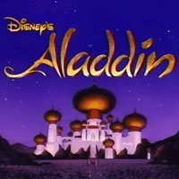 Aladdin
The designers who created Aladdin’s typography made a study of Arabic lettering. Unlike some of the other pieces you have seen in this little Disney study, this font is not inspired by any font that is available on most computers. This elegantly hand-crafted type has great movement and really captures the feel of the tales of the Arabian Knights. Add the touch of gold and you have some extremely sharp typography.
Which of Disney’s typography ideas do you like best?
Do you have some favorite Disney typography ideas that aren’t on this list? Which movie has your favorite typography and why? What lessons can small businesses take away after looking at Disney’s typography? Drop us a line. We would love to hear your thoughts.