 It’s important that your marketing materials are easy to read.
Do your billboards, posters and signage pass the three-second test? Do you want people to have to squint to understand your message?
Check out these levels of visibility to see where your materials are stacking up.
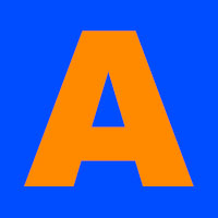
 1st Place: Contrast
Contrast is king in your marketing materials that must be read from a distance. Think in terms of billboards, posters and signs. Always aim for contrast because not only is it easy to read, but it also attracts attention in the first place. When people see a high-contrast image out of the corner of their eye, they tend to look. Contrast is created by combining VERY light colors with VERY dark colors. Try for combinations like black and yellow, charcoal and white, black and white, etc.

2nd Place: High Visibility
High visibility means that your marketing materials are easy to read from far away. High visibility means you can see it… but stark contrast is best. High visibility works well in places where people may have a few more seconds to spare. Contrast is best for a billboard, but high visibility will work fine for an overview brochure.
 3rd Place: Vibration
 3rd Place: Vibration
Vibration usually applies to complimentary colors being used against each other: red on green, yellow on purple, blue on orange, etc. Vibration can also apply to neon colors in your marketing materials. Vibration is bad because it causes the eyes to misunderstand where the lines of the letters are. If you look at the letters too long, you’ll start to go cross-eyed. Vibration also presents problems for colorblind people.
Dead Last: Low Contrast
 Dead Last: Low Contrast
The only thing worse than vibration is low contrast. Think royal blue on navy, pink on red, yellow on white, etc. If your materials are low contrast, fix it quick. Chances are, your customers are glossing right over your message and looking at the high-contrast poster or billboard right next door. Even if they tried to read your marketing materials, they may not be able to do so. (Again, don’t forget our colorblind friends!)
When These Rules Do NOT Apply:
All of that said, don’t forget that signage is very different from body copy. Don’t make the mistake of applying visibility rules to large blocks of text… you will make your readers cry.
Need help with your marketing materials?
Drop up a line, we are happy to help!